Let's talk about Colour!
- Jun 17, 2020
- 2 min read
Updated: May 10, 2024
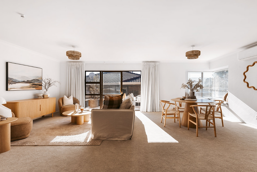
While browsing through magazines and interior styling books I often stumble across images of interiors that are defined by strong and bold colours. Yet, when consulting for home renovations, especially ones involving imminent sales, we tend to offer a colour palette that is neutral, with soft tones and high tonal values.

But if we are to create our own perfect home, then we should give some serous thought about the colours we choose, both for walls and soft furnishing. We should take in consideration the function of each space, and select colours that have a psychological value aligned with it.
Colours not only have an effect on the styling results on a space but most importantly they have the power to strongly influence moods and work as a communicating tool to transmit the personality of the home owner.
Light airy hues offer a feel of space, freshness and rightness, low tonal values bring moodiness, warmth and sophistication to a room. While neutral colours offer an option of being uncommitted, selecting the right hues for a property is not an easy task.

This year Dulux Canada has facilitated the process by declaring BLUE CHINA PORCELAIN their Colour of the year 2020. Blue is an excellent option for those that are in need of a safe colour. Is calming, stable and the colour of knowledge, integrity and stability. It's constant and elegant, allowing you to utilize both reach wood tones and natural wood tones to decorate your home. Blue is a cold colour and well suited for bedrooms bathrooms and kitchens. I would personally embrace warmer hues in the entrance of the house to allow for a welcoming feel.
Dulux UK & NZ, have instead declared TRANQUIL DAWN their choice for 2020.
Again a cold colour, Tranquil Dawn is fresh, unimposing and sophisticated with a touch of natural ingrained in it. Green Hues are in my opinion underrated and a fantastic option for many properties in NZ. They connect us to our landscape, bringing the natural world inside our homes and allowing us to disconnect from the chaotic and demanding daily grind.
As a cold hue, is calming and fresh, yet, when used in the right intensity and shade can offer sophistication and richness.

Different shades of green can be introduced in different areas and is a colour that suits every room of the house, from entryways to kitchens to bathroom and bedrooms. Paired with grey, soft pinks, mustard and even blue can make this colour your perfect partner for a dynamic, on trend and interesting colour scheme.
As I evolve, I find myself constantly preferring different styles, colours, patterns and combinations. And as I converse more often with clients I am realizing that each individual absorbs colours in a unique and different way.
We will probably all evolve and require a change of hues in our surrounding, and as we grow older and wiser, colours will talk to each of us differently.
So let's be open to change when is time to re decorate, and allow our inner feel to connect with the right colour for our moods .


Comments